

86 THE SILENCE
From Mission to Real-World Impact
Hope For The Day (HFTD) is a non-profit dedicated to proactive suicide prevention and mental health education, with a focus on making conversations more accessible within youth and creative communities. 86 the Silence, a program within its education department, extends this mission into the hospitality sector by partnering with bars, restaurants, and service-based businesses to integrate mental health awareness into everyday social spaces through shared messaging, community engagement, and occasional fundraising efforts.
WHAT'S THE REQUEST
Client
We are looking for a logo redesign that feels more bold while giving first-time viewers a clearer sense of what 86 the Silence represents. 86 the Silence focuses on education around not bottling up emotions and preventing them from building to a breaking point. We primarily work with businesses in the hospitality sector, so we are looking for a variation that reflects this environment, as we also frequently partner with them on shared initiatives and campaigns.
Got it. I understand the direction and will focus on a bolder logo that clearly communicates the idea of not bottling up emotions while also reflecting your connection to the hospitality space. I will explore variations that balance message clarity and industry relevance.
Me
1
UNDERSTANDING
Emotional Messaging and Brand Language
First I analyzed Hope For The Day’s existing identity and previous campaigns. A key focus was understanding how they communicate emotional buildup and release through language and design. One recurring theme was the idea of “bottling things up” and the consequences of internalized emotion. I also looked at how their older visual systems were structured and where the current logo no longer aligned with their evolving message.
2
STRATEGY
Translating Emotional Pressure Into Visual Metaphor
The initial strategy explored emotional buildup as a visual system. The first concept used a literal “explosion” to represent suppressed emotions. After review, the direction shifted to a more subtle and grounded approach, moving from explosion to the bottle cap concept. This connects back to their campaign message, “don’t let the bottle explode,” while evolving the identity in a more controlled and intentional way that aligns with their history.
3
DESIGN
Refining symbolism into A Scalable Identity System
I simplified the bottle cap concept into a clear, recognizable mark that functions as a modern logo system. The focus was on clarity, scalability, and emotional symbolism without being overly literal. The design was refined to feel intentional and minimal, ensuring it works across digital, print, and campaign applications while maintaining emotional weight.

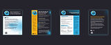
CONCEPT DEVELOPMENT
*Each logo variation maintains a consistent font style to reinforce the brand’s grunge aesthetic*


This logo variation emphasizes the impact of suppressed emotions, represented through the idea of something building up and bursting.
This logo variation focuses on representing the bottle cap as a direct symbol of the message ‘don’t bottle things up,’ translating the concept into a clear visual form.
This logo variation is tailored toward the hospitality sector, aligning with the preferences and visual expectations of their primary audience while maintaining clarity, warmth, and approachability.


Evolved Identity Rooted In Existing Brand Equity
The final direction creates a smoother transition from the original identity while still pushing the brand forward. It respects existing campaign language while giving the organization a more contemporary and flexible visual system.
Stronger Emotional Symbolism
By shifting from a literal “explosion” concept to the “bottle cap” metaphor, the identity becomes more controlled and meaningful. It communicates emotional containment and awareness without being visually aggressive or overstated.
Scalable Across Campaigns And Touchpoints
The new mark works across multiple applications including digital platforms, campaign materials, and educational content. Its simplicity allows it to function consistently while still carrying conceptual depth.
What I've Learned
Refinement Is Stronger Than Literal Interpretation
I learned that emotional concepts don’t always need to be represented directly. The strongest solution came from refining the idea rather than amplifying it. Moving from “explosion” to “bottle cap” made the message more sustainable and aligned with the brand’s long-term communication style.