HYDRO
BRANDING & PACKAGING FOR HYDRATION
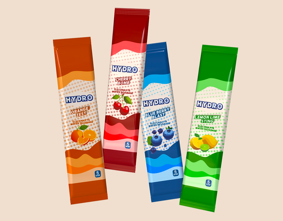
I DEVELOPED A COHESIVE LOGO AND PACKAGING PROJECT FOCUSED ON MONOCHROMATIC BRANDING. INTRODUCING HYDRO, A FUN, BRIGHT, AND STRATEGICALLY POSITIONED PACKAGE DESIGNED TO APPEAL TO YOUNGER CONSUMERS.
CLEAN, SIMPLE, & HEALTHY
THE GUIDELINES ESTABLISH A BRIGHT, PLAYFUL IDENTITY. ALL PACKAGING MUST MAINTAIN HIGH READABILITY, HEALTH FOCUSED MESSAGING, AND VISUAL CONSISTENCY TO STRENGTHEN TRUST AND BRAND RECOGNITION.


The logo for "Hydro" features a distinctive design that symbolizes the brand's commitment to hydration and flavor.
The outlined in navy blue, creating a bold and clear visual impact.
Within this outline, the letters are filled with a gradient of varying shades of blue, artistically representing the different flavors offered by the brand.
These shades of blue are carefully chosen to evoke images of the ocean's tides, symbolizing fluidity, refreshment, and the natural essence of water.
THE 3D MODEL MAKES THE PACKAGING FEEL ACTIVE AND ENERGIZED

PLAYFUL FRUIT ILLUSTRATIONS CAPTURE KIDS’ ATTENTION WHILE REMAINING PREMIUM AND PARENT-APPROVED.

THE BRIGHT, ENERGETIC PALETTE SIGNALS FRESHNESS AND HEALTH, ALIGNING THE PRODUCT VISUALLY WITH ITS FUNCTIONAL BENEFITS.

