
MATRIX
The main goal of this project was to create a set of branded banners for the client’s internal database, called "Matrix," where all essential company assets are stored. The client wanted a visually engaging and futuristic design that felt “cool” and thematic, while still being clear and easy to understand. They were inspired by the Matrix movie aesthetic but were open to creative interpretations that aligned with their brand identity and purpose.
ORIGINAL DESIGN
The first design was based directly on the sketch the client brought to me, heavily inspired by the Matrix movie. It featured the classic falling green numbers and dark digital aesthetics. This was the visual foundation that sparked the entire project.
DRAFT DESIGNS
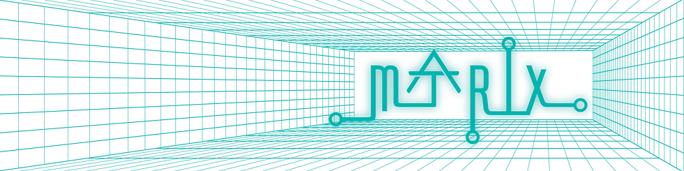

This concept explored a grid tunnel system to represent the feeling of entering a digital space. The tunnel effect was designed to give the impression of traveling through a data stream, leading toward the core of the company's asset hub.


For this design I brought in a more personalized touch by incorporating the Chicago L train system. I visualized it like wires within a database, with each stop acting as a hub. The stops featured a smooth ombre effect, tying into the idea of data nodes glowing within the system.


This draft brought back the grid tunnel look but introduced actual assets that would be found in the database. Icons and visuals zoomed in and out, representing files being accessed or stored. This version made the purpose of the page more clear while keeping the futuristic theme.


This last design followed a similar theme to the second but used a different composition. It adjusted the layout and visual balance while keeping the wireframe and ombre hub concept, giving the client another way to visualize the same idea with a fresh structure.
FINAL DESIGN

The final design was a refined version of the third draft, which the client chose as the winning direction. It combined the visual storytelling of data movement with clarity and brand cohesion. All designs were built using the company's brand guidelines and color palette to ensure everything stayed on-brand while exploring these creative directions.